The Bright Side

Culture & Education — Arts

Creative achievements, educational progress, culinary discoveries, and cultural celebrations

1204 stories

Colossal8/27/2026

Pattern and Bold, Saturated Color Commingle in Ben Sledsens’ Rhythmic Paintings

While bold in color, Ben Sledsens' oil-and-acrylic paintings are quiet and intimate. Do stories and artists like this matter to you? Become a Colossal Member today and support independent arts publishing for as little as $7 per month. The article Pattern and Bold, Saturated Color Commingle in Ben Sledsens’ Rhythmic Paintings appeared first on Colossal.

Hyperallergic8/27/2026

Hyperallergic Fall 2026 New York Art Guide

From Brancusi’s modernism to Krasner and Pollock’s midcentury stylings to Arthur Jafa’s contemporary lens, there’s something for everyone this season.

Colossal8/27/2026

‘Handmade Utopia’ Relishes the Architecture of California’s Back-to-the-Land Movement

The new book by David Jacob Kramer, with photos by Michael Schmelling, represents a counterculture that, though changed, is still alive and well. Do stories and artists like this matter to you? Become a Colossal Member today and support independent arts publishing for as little as $7 per month. The article ‘Handmade Utopia’ Relishes the Architecture of California’s Back-to-the-Land Movement appeared first on Colossal.

LitHub8/27/2026

Lit Hub Daily: August 27, 2026

What do you do when your writing group thinks your story’s hilarious (when it’s not supposed to be)? | Lit Hub Advice If you have a free afternoon, try reading one of these novellas from cover to cover. | Lit

Fast Company Co.Design8/27/2026

You can now buy Billie Jean King’s famous blue suede shoes from Battle of the Sexes

Billie Jean King had to fight to wear blue suede shoes during her famous Battle of the Sexes match that she won in 1973 against Bobby Riggs. Now Adidas has turned the silhouette into a lifestyle shoe. Some 90 million people around the world watched King defeat Riggs in the match at Houston’s Astrodome. “I underestimated you,” Riggs told King after she beat him. While Riggs wore a “Sugar Daddy” jacket to the match, King wore a mint dress designed by the designer Ted Tinling, with a blue wristband and blue suede Adidas shoes because she wanted some color. Billie Jean King returns a shot against Bobby Riggs during the Battle of the Sexes match at the Astrodome on September 20, 1973, in Houston. [Photo: Focus on Sport/Getty Images] With the 2026 U.S. Open in full swing, Adidas has reimagined King’s famous shoe as a lifestyle shoe for the first time. Called the Billie Jean King Shoe, it’s selling for $110 a pair. The shoes come with an image of King and her signature on the tongue and the match’s set scores on the back. They come in either blue or off-white. Billie Jean King [Photo: Adidas] “The goal was to preserve the look and spirit of Billie Jean King’s original Blue Suede Shoe while adapting it into a silhouette that could live naturally in today’s lifestyle footwear landscape,” an Adidas spokesperson tells Fast Company. King said in a statement that the shoe will always represent more than one match. “They remind me of the progress we’ve made, but also of the work that is still ahead of us,” she said. “I hope bringing them back inspires the next generation to keep pushing for equality and to use their voices to create positive change.” [Photo: Adidas] King donated her pair to the Center for Women’s History in 2016.She said she had to push for it at the time instead of wearing a white shoe. “They didn’t want want me to since we all wore white with blue stripes but I said ‘No, I want color,'” she told Hypebae in 2018. [Photo: Adidas] Adidas released the Blue Suede Shoe as a performance tennis shoe in the 1970s, and it was the German sportswear brand’s first colored velour tennis shoe on the market. More recently, it has brought back the colorway to promote King’s Here to Create Change campaign to encourage young women in sports. In 2018, Adidas released a limited-edition blue-and-white AM4BJK shoe, and held a BJK Your Shoes activation at the U.S. Open to spray paint people’s shoes blue no matter the brand. By bringing back the shoe and colorway in a way new for a wider audience, Adidas is paying homage to the famous shoes and the message they represent for a new generation.

Fast Company Co.Design8/27/2026

These 60-sided dice never have to be rolled twice

A standard six-sided die has one simple shortcoming: You’ve got a 1 in 6 chance of getting the same number as your opponent when you’re rolling to go first in a game. Eric Harshbarger has a solution for that. More than a decade ago, Harshbarger, a senior lecturer at Auburn University’s College of Sciences and Mathematics, and a group of mathematicians and computer scientists embarked on a journey to create a set of five dice that would be unimpeachably fair. Their parameters? Rolling the dice should never result in a tie, and every player should have a mathematically equal chance of rolling the highest number. After many iterations, they finally came up with a design that works. They created the Go First Dice, a set of five 60-sided dice, with the numbers 1 through 300 spread across their faces. Their dice are now represented in a sculpture at Auburn University’s new STEM + Agricultural Sciences Complex. The pieces of the sculpture are fashioned from different types of wood—pine, poplar, red oak, walnut, and mahogany. Each weighs more than 100 pounds and is about three-and-a-half feet in diameter. [Photo: Jean Caputo] The idea for the dice came from a conversation Harshbarger had with James Ernest, founder of Cheapass Games, at a gaming convention in 2010. Ernest wondered if it was possible to create no-tie dice. Harshbarger found the question to be an intriguing math problem to solve. “I don’t think he [Ernest] had any idea so much research would be thrown at the question,” Harshbarger says. “There are plenty of much easier ways to fairly decide who goes first in a board game, but the mathematics behind the question fascinated me, and the quest for sets of ‘Go First Dice’ began.” Harshbarger began working on the problem with Robert Ford, a mathematician, and they soon found a solution with four 12-sided dice that used the numbers 1 through 48. Then came the bigger challenge: Could they do it with five dice? Creating five no-tie dice with an equal chance of rolling the highest number requires lots of math to determine the right numbers to include on each die. “We’re talking numbers way greater than the number of atoms in the universe—that kind of thing,” Harshbarger tells Fast Company. Harder yet was ensuring the dice could roll. An early attempt with a 120-sided die they designed was about the size of a baseball. Harshbarger’s project to design the dice took more than a decade, work from a core group of about six researchers, and contributions from even more. The Canadian researcher and software engineer Paul Meyer finally found the solution for the 60-sided dice in 2023 that arranged the numbers in just the right way so each piece had an equal chance of rolling the highest number, regardless of where two, three, four, or all five of dice in the set are used. The group’s work, including 60- and 12-sided dice sets, is available at the website Math Art Fun. Having to roll dice only once saves players seconds. Figuring out how to do it fairly took researchers years, and the new sculpture memorializes the work it took to figure it all out.

Fast Company Co.Design8/27/2026

Why this company ditched tech blue for construction yellow in its new logo

For years, the connected operations company Samsara positioned itself as a digital tool, and it had the branding to match. Its old logo was a blue, abstracted owl with a nondescript lowercase sans-serif wordmark that looked generically tech but didn’t say anything about what the company does. As it grows, however, Samsara’s new rebrand tells more of a story about the physical, real world places its product shows up. Samsara sells software and solutions for fleet management and physical operations. The company describes its customers as asset-heavy and labor-intensive, like the shipping and logistics company DHL, the car rental service Hertz, and Sears Home Services, which provides in-home appliance repair. Samsara does things like improving their routing and reducing accidents and safety incidents, which adds up, especially for its biggest customers that have operating costs totaling about 80% of revenue. Samsara’s San Francisco office, 2025. [Photo: Smith Collection/Gado/Getty Images] Instead of a vague tech-style visual identity, the rebrand from the creative studio Base Design looks more like a construction company, with a bolder logo and a yellow color scheme that looks like the equipment used by some of its customers. It’s designed to convey the idea of building. [Image: Samsara] The rebrand comes as Samsara grows due to factors like AI data center construction, government investment in aging infrastructure, waste intelligence for garbage and recycling collection, and ridership management for transit systems. Samsara announced 30% year-over-year growth in June, with nearly $2 billion in annual recurring revenue; the rebrand lands as the company looks to build on that momentum. After speaking with Samsara customers, including people in senior leadership, frontline operators, and truck drivers, designers from Base Design landed on a central theme for the brand’s visual identity of “build with,” positioning Samsara as a partner for building together. [Image: Samsara] “It’s an ongoing thing, building with the customers, building with the engineers, like doing things hand in hand, and then iterating and repeating,” Base Design’s creative director, Daniel Peterson, tells Fast Company. The idea that Samsara is always building “became sort of an organizing idea,” he says. The aim was to blend two different aesthetics to represent Samsara in the lab and in the field, or its work with engineers versus on the ground with customers, drivers, workers, trucks, and equipment. [Image: Samsara] For the look of the “lab,” designers used technical typography, grids, and structured information. For “field,” it was a signal yellow color, handwriting elements, and a dramatic photography style that give a sense of being at a work site. The handwriting font was designed based on handwriting samples from actual Samsara engineers, to replicate their rhythm and idiosyncrasies. The Samsara wordmark is now written in a wide, all-caps, sans-serif typeface that looks sturdy. Base Design worked with the German type foundry NaN on the fonts, Samsara Sans and Samsara Script. [Image: Samsara] The logo for the company’s mascot, Sam the owl, also got a significant redesign. The mark was designed to move, like an animation on the company’s homepage that shows it looking to the side and blinking. It’s designed to look active, and emerged after numerous small adjustments around elements like brow, head tilts, speed, and pace. Its personality is meant to be a supporting partner that’s curious, watchful, and protective. “A big part of this was not just talking about all the wonderful things Samsara does in terms of its products and services, but also to elicit that emotional response from the end users in order for them to almost understand how much they know they love the brand,” says Geoff Cook, a Base Design partner, likening the B2B Samsara to B2C brands like Carhartt, John Deere, DeWalt, or Milwaukee Tool. Visual identities for companies that are business-facing often focus on products, features, and benefits, which don’t usually inspire the sort of passion, loyalty, and fandom that more expressive consumer-facing brands are capable of building. As Samsara looks ahead to expand on its growth, the hope is the new brand will invite some B2C-style love from the company’s B2B customers by looking more like a company that builds things than just a tech company that makes software.

Walla! Interior Design8/27/2026

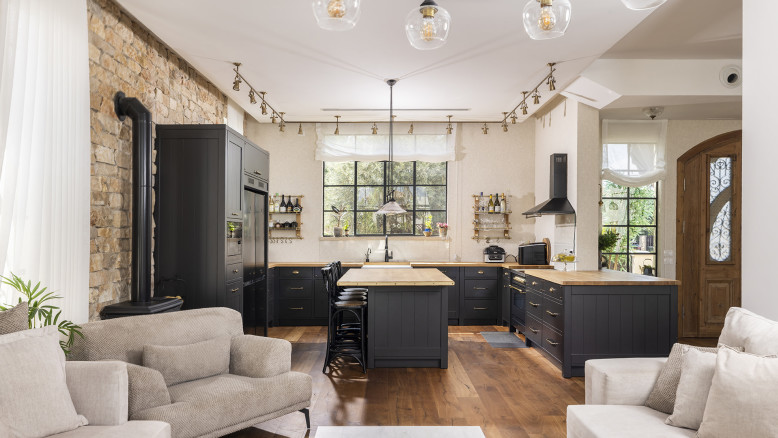
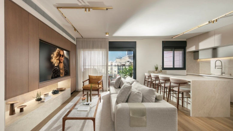
Pool, cinema and gym: the house you have no reason to ever leave

A private house of about 450 square meters was designed for a couple and their three children on a plot of roughly half a dunam in central Israel. Behind the pool, cinema room and private suites lies a precise design by architect Shirley Dan, which blends European architecture, Israeli lifestyle, and daily thinking about comfort.

LitHub8/27/2026

The Letter Doula: How to Help a Life Arrive on the Page

For years, I believed people avoided letter writing because they lacked time. But after teaching leadership, communication, and storytelling to thousands of students, I’ve come to believe something else entirely: People do not avoid writing because they’re busy, or even

LitHub8/27/2026

Short But Sweet: Nine Novellas To Read In a Single Afternoon

In anticipation of the publication of my novella, American Moon, I’ve been thinking a lot about the form. Novellas are tiny in the world of books, but they’re good for readers in a self-inflicted time-squeezed age. We all know that

LitHub8/27/2026

Six Novels That Try to Keep Up With Elizabeth Taylor

I first saw Elizabeth Taylor in The VIPs, when I was a moony and impressionable teenager. There were nuances I surely missed, but the movie’s larger premise came through loud and clear: life could be fabulous, dramatic, and shaped—perhaps even

Colossal8/26/2026

Mischievous Cats Rule in Minyoung Kim’s Affectionately Quirky Paintings

When it comes to felines, the artist revels in "the contrast between how ordinary and how weird they are." Do stories and artists like this matter to you? Become a Colossal Member today and support independent arts publishing for as little as $7 per month. The article Mischievous Cats Rule in Minyoung Kim’s Affectionately Quirky Paintings appeared first on Colossal.