Bangkok Post Life8/28/2026
The need for speed
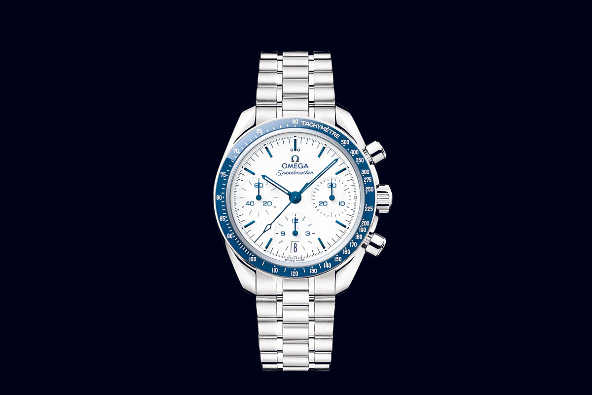
Revisiting the Speedmaster 38, Omega gravitated towards the legendary Moonwatch for the aesthetics of a new collection, released on Tuesday.
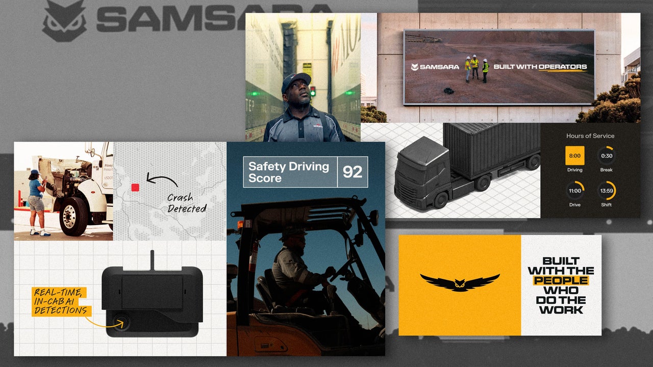
For years, the connected operations company Samsara positioned itself as a digital tool, and it had the branding to match. Its old logo was a blue, abstracted owl with a nondescript lowercase sans-serif wordmark that looked generically tech but didn’t say anything about what the company does. As it grows, however, Samsara’s new rebrand tells more of a story about the physical, real world places its product shows up. Samsara sells software and solutions for fleet management and physical operations. The company describes its customers as asset-heavy and labor-intensive, like the shipping and logistics company DHL, the car rental service Hertz, and Sears Home Services, which provides in-home appliance repair. Samsara does things like improving their routing and reducing accidents and safety incidents, which adds up, especially for its biggest customers that have operating costs totaling about 80% of revenue. Samsara’s San Francisco office, 2025. [Photo: Smith Collection/Gado/Getty Images] Instead of a vague tech-style visual identity, the rebrand from the creative studio Base Design looks more like a construction company, with a bolder logo and a yellow color scheme that looks like the equipment used by some of its customers. It’s designed to convey the idea of building. [Image: Samsara] The rebrand comes as Samsara grows due to factors like AI data center construction, government investment in aging infrastructure, waste intelligence for garbage and recycling collection, and ridership management for transit systems. Samsara announced 30% year-over-year growth in June, with nearly $2 billion in annual recurring revenue; the rebrand lands as the company looks to build on that momentum. After speaking with Samsara customers, including people in senior leadership, frontline operators, and truck drivers, designers from Base Design landed on a central theme for the brand’s visual identity of “build with,” positioning Samsara as a partner for building together. [Image: Samsara] “It’s an ongoing thing, building with the customers, building with the engineers, like doing things hand in hand, and then iterating and repeating,” Base Design’s creative director, Daniel Peterson, tells Fast Company. The idea that Samsara is always building “became sort of an organizing idea,” he says. The aim was to blend two different aesthetics to represent Samsara in the lab and in the field, or its work with engineers versus on the ground with customers, drivers, workers, trucks, and equipment. [Image: Samsara] For the look of the “lab,” designers used technical typography, grids, and structured information. For “field,” it was a signal yellow color, handwriting elements, and a dramatic photography style that give a sense of being at a work site. The handwriting font was designed based on handwriting samples from actual Samsara engineers, to replicate their rhythm and idiosyncrasies. The Samsara wordmark is now written in a wide, all-caps, sans-serif typeface that looks sturdy. Base Design worked with the German type foundry NaN on the fonts, Samsara Sans and Samsara Script. [Image: Samsara] The logo for the company’s mascot, Sam the owl, also got a significant redesign. The mark was designed to move, like an animation on the company’s homepage that shows it looking to the side and blinking. It’s designed to look active, and emerged after numerous small adjustments around elements like brow, head tilts, speed, and pace. Its personality is meant to be a supporting partner that’s curious, watchful, and protective. “A big part of this was not just talking about all the wonderful things Samsara does in terms of its products and services, but also to elicit that emotional response from the end users in order for them to almost understand how much they know they love the brand,” says Geoff Cook, a Base Design partner, likening the B2B Samsara to B2C brands like Carhartt, John Deere, DeWalt, or Milwaukee Tool. Visual identities for companies that are business-facing often focus on products, features, and benefits, which don’t usually inspire the sort of passion, loyalty, and fandom that more expressive consumer-facing brands are capable of building. As Samsara looks ahead to expand on its growth, the hope is the new brand will invite some B2C-style love from the company’s B2B customers by looking more like a company that builds things than just a tech company that makes software.
Curated from Fast Company Co.Design. Classified as Culture & Education by AI, which sometimes makes mistakes.
Revisiting the Speedmaster 38, Omega gravitated towards the legendary Moonwatch for the aesthetics of a new collection, released on Tuesday.
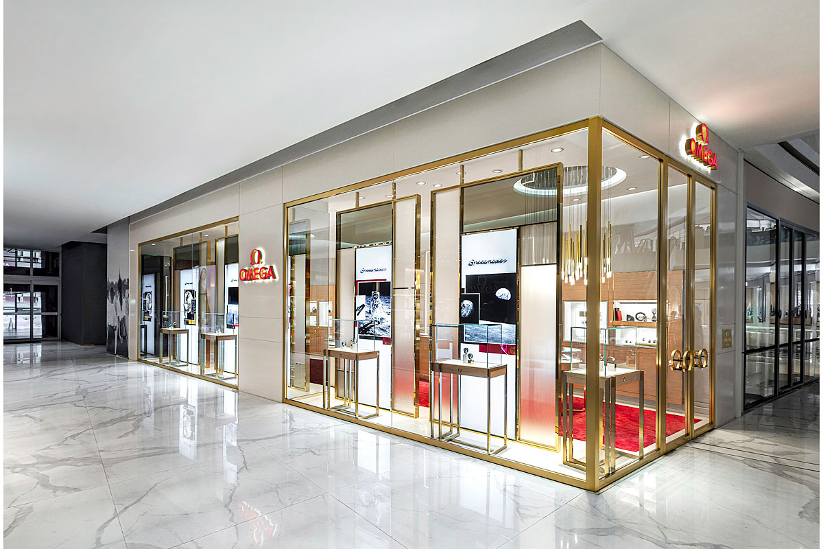
Omega's new boutique recently opened its doors at Iconsiam, a landmark on the Thon Buri side of the Chao Phraya River.
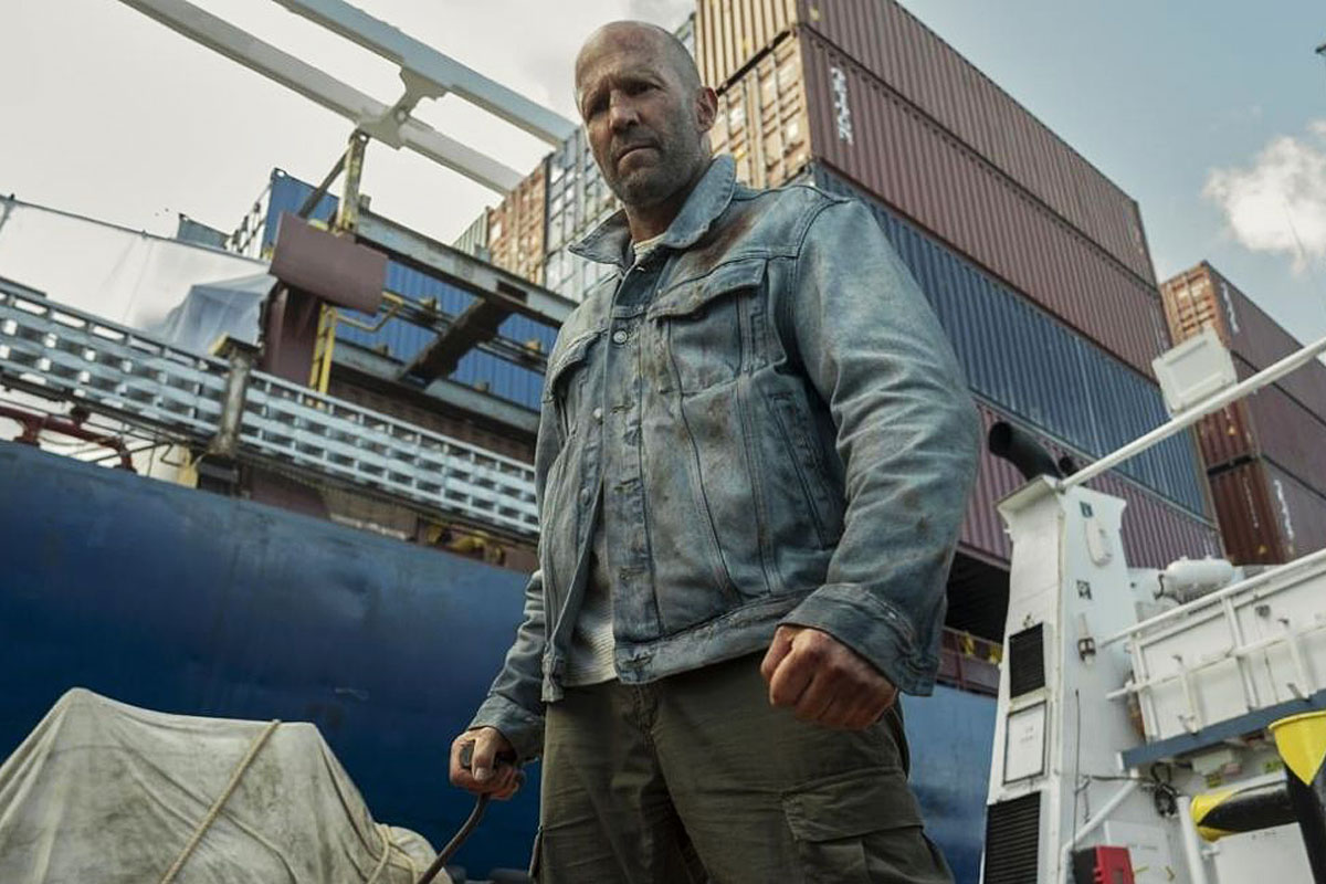
In modern action cinema, Jason Statham has become one of the most recogniseable faces of the genre. Unlike many other actors, he seems willing to take on just about any kind of action production, whether it is big or small-budget, successful or not.